Mastering the Art of Airbnb Painting: Insider Tips
As vacation season unfolds, Airbnb hosts have a golden opportunity to attract guests to their properties. One crucial element that significantly influences guests’ first impressions is the interior design, where the right choice of painting colors plays a pivotal role in creating a captivating ambiance. In this article, we will guide Airbnb hosts through the latest painting color trends that are sure to entice guests and elevate their overall experience during their stay. Additionally, we will explore the importance of creating a cohesive color scheme that effortlessly unifies different areas of the property, resulting in a seamless and delightful experience for vacationers. Stay ahead in the hosting game by embracing the current Airbnb painting trends and empowering your space to become an alluring and inviting haven for travelers.
Top Airbnb Painting Trends in 2023
Warm Earthy Tones: Embrace Nature Indoors
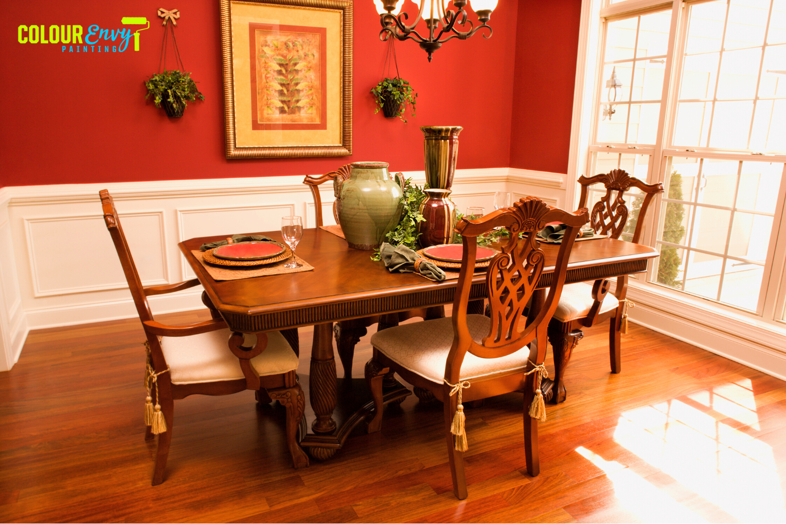
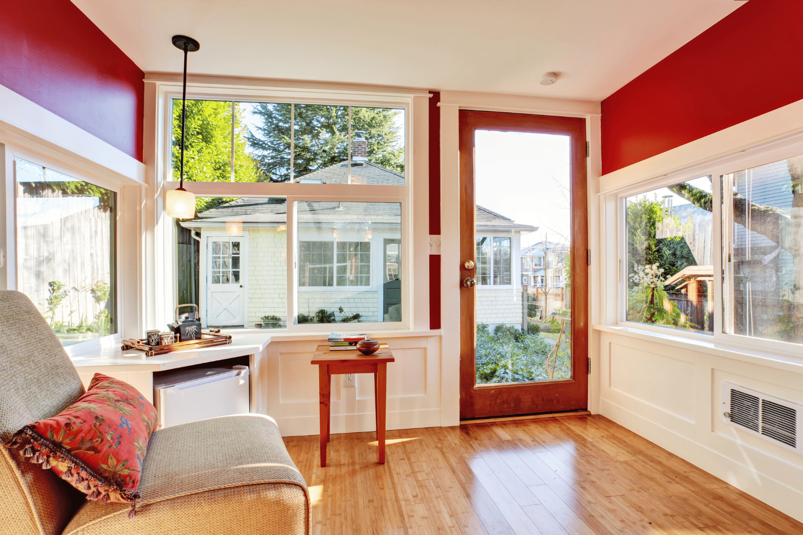
Earthy tones like terracotta, warm browns, and olive greens have gained popularity in recent years. These colors evoke a sense of comfort and connection with nature, making guests feel at ease during their stay. Consider using these hues for accent walls, ceiling, and decorative elements when painting your Airbnb to create a cozy and welcoming atmosphere.
Serene Blues: Create a Relaxing Retreat
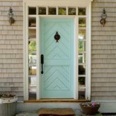
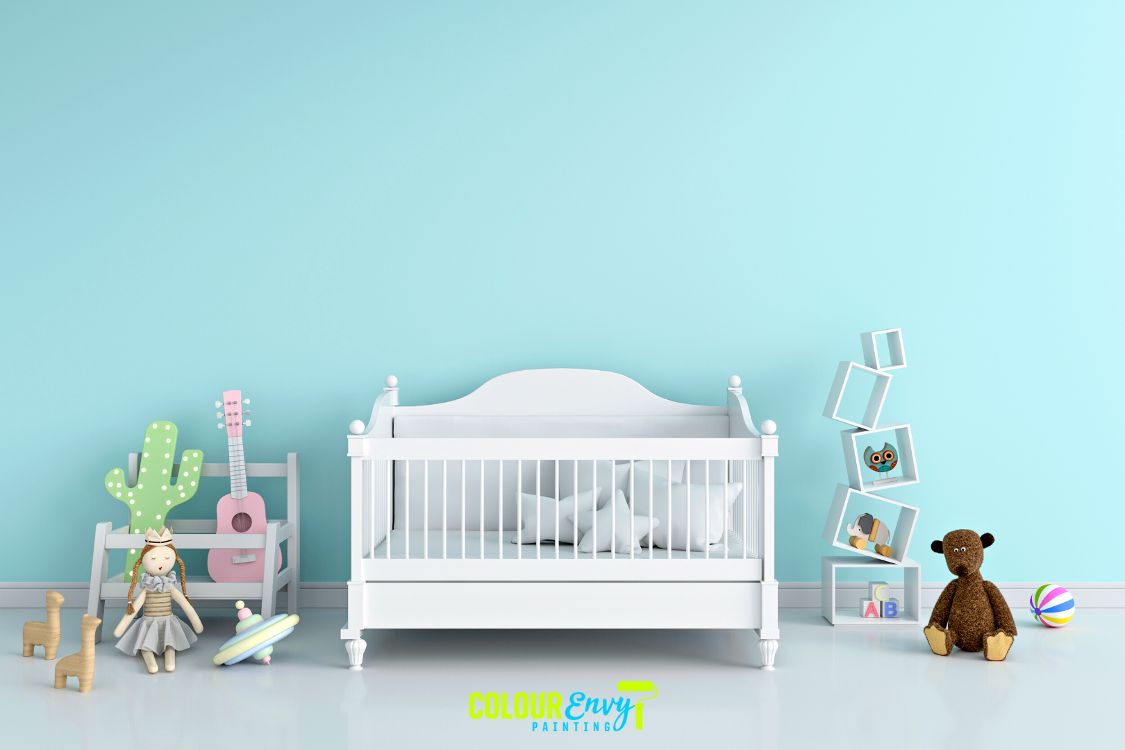
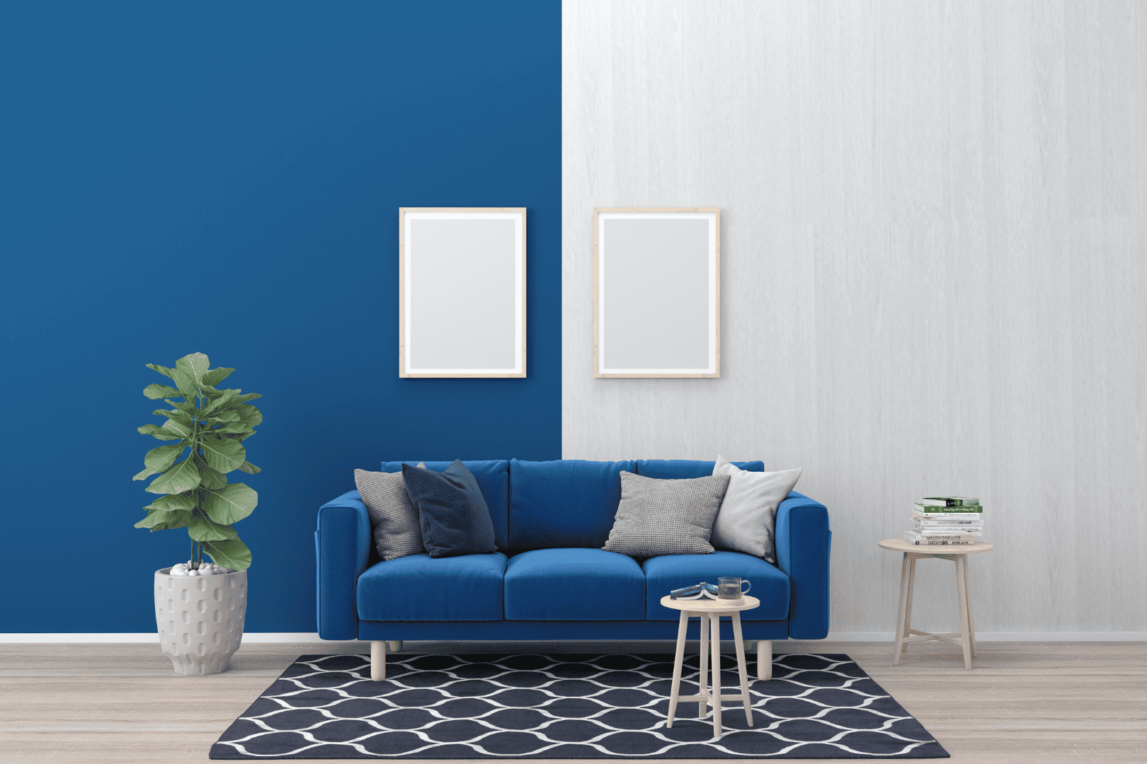
Shades of blue, especially soft and serene tones like sky blue and seafoam green, have become a go-to choice for creating a relaxing retreat. These colors promote a sense of tranquility and can be ideal for bedrooms and living spaces, providing guests with a calming environment to unwind after a day of exploring.
Jewel Tones: Add Sophistication and Drama
Rich jewel tones like emerald green, sapphire blue, and amethyst purple have made a bold statement in interior design trends. Incorporating these luxurious colors through accent pieces, siding, or even fence can add a touch of opulence and sophistication to your Airbnb, leaving a lasting impression on your guests.
Neutrals with a Twist: Incorporate Hints of Color
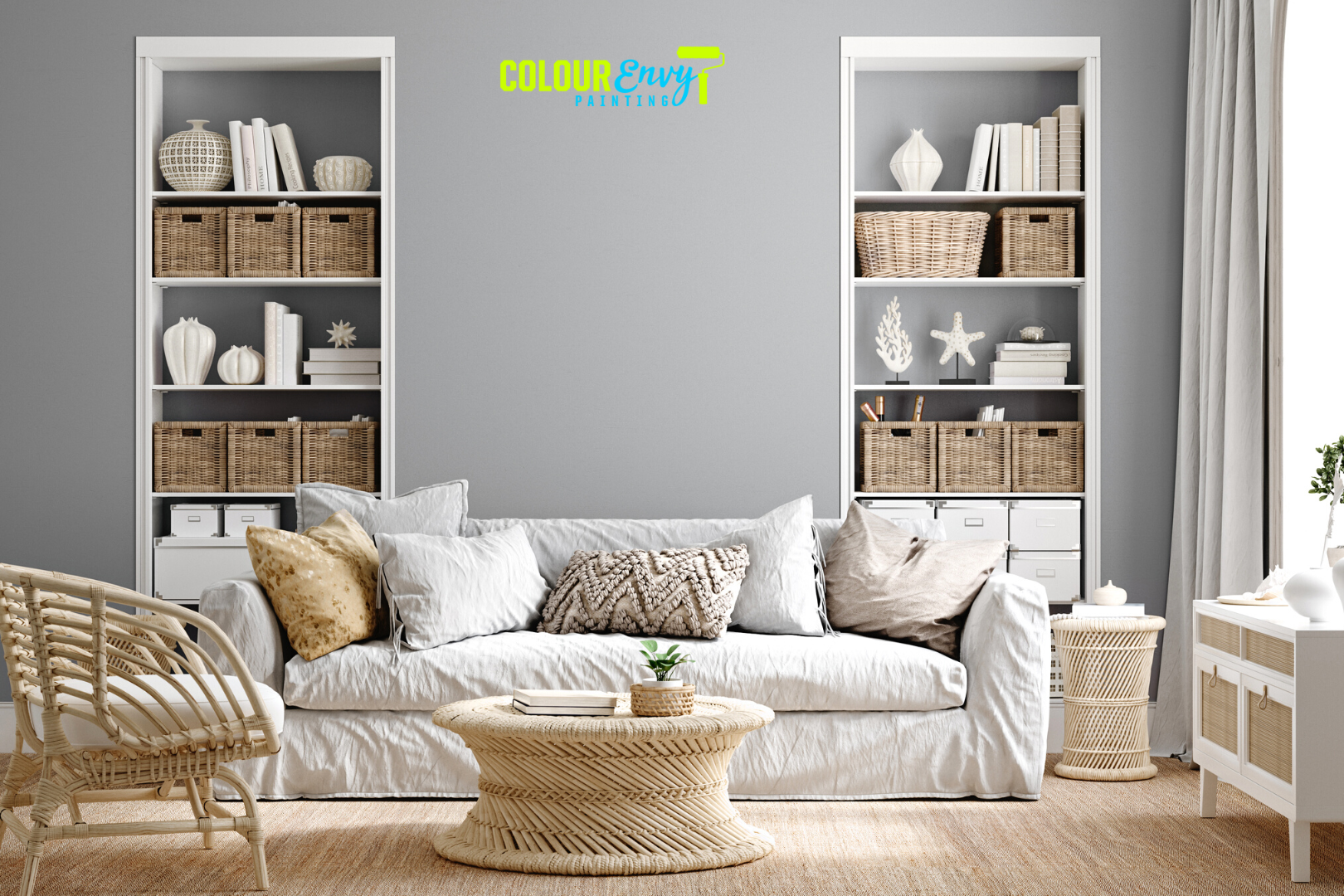
While neutrals like white, beige, and gray remain timeless choices, current trends lean toward neutrals with a twist. Consider incorporating subtle pops of color, such as blush pink, dusty rose, or pale mint, to add a touch of freshness and personality to your space without overwhelming the overall aesthetic.
Monochromatic Schemes: Sleek and Modern Vibes
Monochromatic color schemes, where different shades of the same color are used throughout a room, have become increasingly popular in modern interior design. Embrace this trend by selecting a dominant color and complementing it with various shades and textures for a sleek and cohesive look in your Airbnb.
Biophilic Design: Merging Nature and Color
Biophilic design, which integrates natural elements into indoor spaces, is gaining momentum. Combine earthy colors with plants, natural materials, and plenty of natural light to create an environment that fosters a connection with nature, promoting guests’ well-being and happiness.
Dos and Don’ts When Aiming to Create a Cohesive Color Scheme for Your Airbnb
Dos:
Start with a Neutral Base: Begin by choosing a neutral color as the foundation for your color scheme. Neutral tones like soft grays, beige, or whites work well as they provide a versatile backdrop that complements various accent colors.
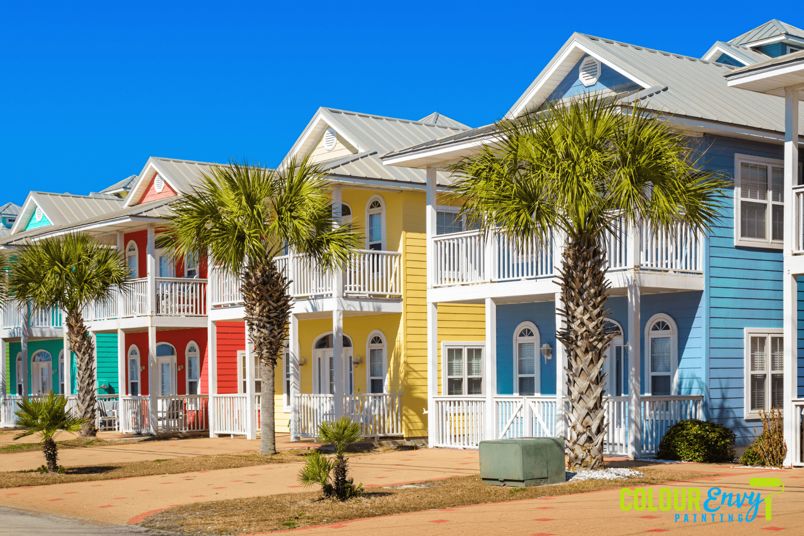
Consider the Property’s Style and Theme: Take into account the style and theme of your Airbnb when selecting colors. For instance, a beach-themed property might benefit from a palette of ocean blues, sandy beiges, and seafoam greens, while a modern urban apartment could use a combination of bold, contrasting colors.
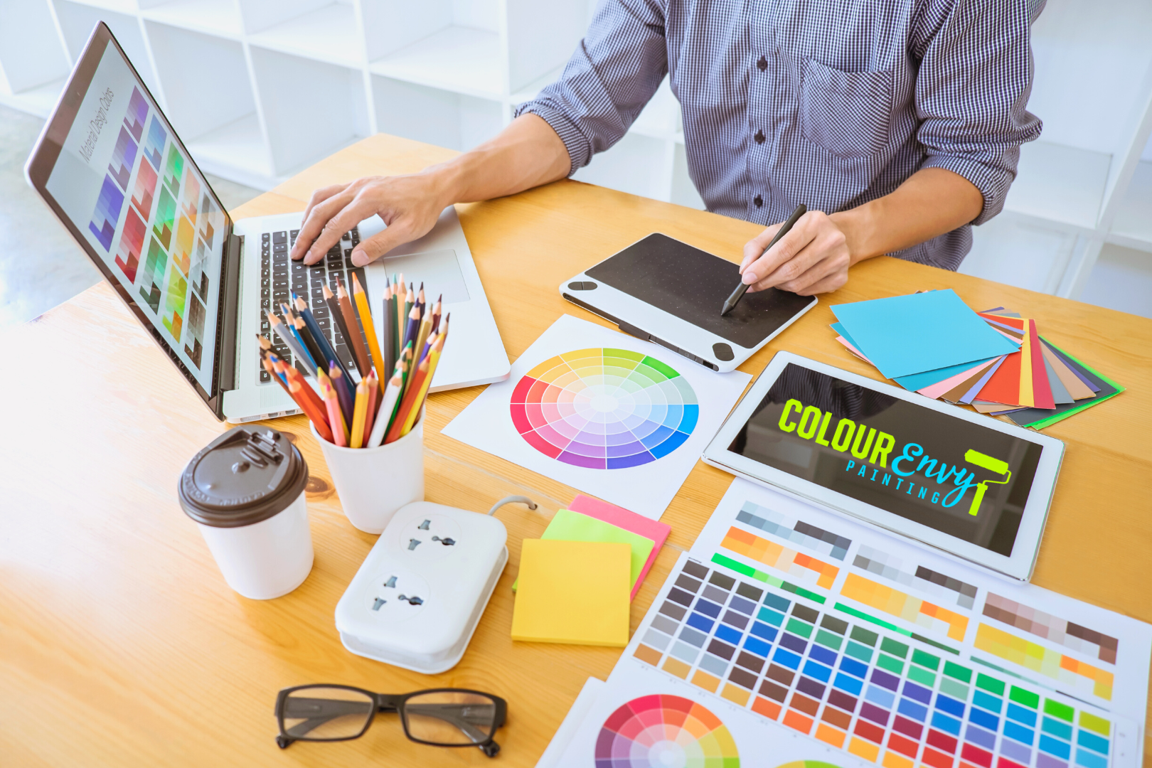
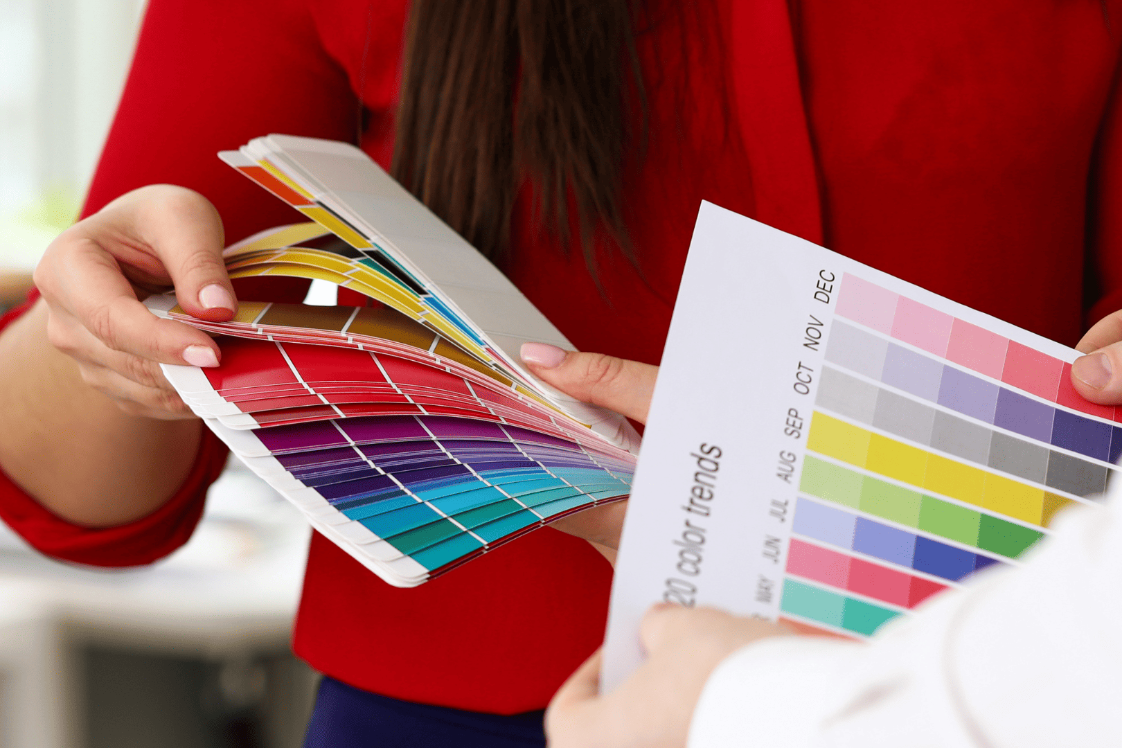
Use a Color Wheel for Inspiration: Familiarize yourself with the color wheel to understand color relationships. Analogous colors (those next to each other on the wheel) create a harmonious and calming effect, while complementary colors (those opposite each other) offer a striking and energetic look.
Limit the Number of Colors: Stick to a maximum of three to five colors in your color scheme. Using too many colors can lead to a chaotic and disjointed appearance, whereas a limited palette creates a unified and sophisticated look.
Use Colors to Define Spaces: Use different colors to define distinct areas within your Airbnb, such as the living room, kitchen, and bedrooms. This subtle differentiation adds visual interest while maintaining overall cohesiveness.
Don’ts:
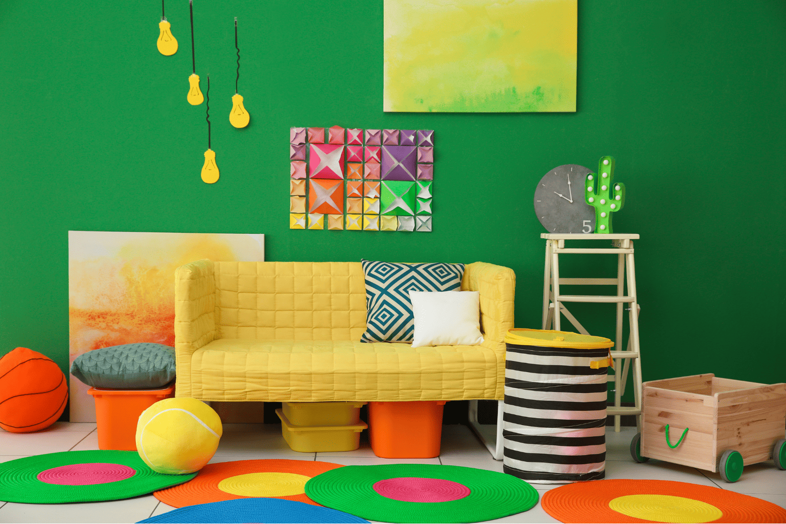
Clashing Colors: Be cautious with color combinations that clash or compete for attention. Colors that clash can create visual discomfort and may turn off potential guests.
Steer Clear of Overly Trendy Colors: While incorporating some trendy colors can be appealing, avoid basing your entire color scheme on passing trends. Trends come and go, and your goal is to create a timeless and enduring aesthetic.
Urge for Random Accents: While pops of color can be delightful, avoid placing random accents throughout your Airbnb without thought. Make sure they complement the overall color scheme and fit naturally into the space.
Neglect Lighting: Keep in mind that lighting affects how colors appear. Test your chosen colors in different lighting conditions to ensure they work well together both in natural and artificial light.
Cluttering the Space: Don’t overcrowd your Airbnb with too many decor items in various colors. Stick to a cohesive color scheme and allow a few well-chosen accessories to shine.
In conclusion, creating a cohesive color scheme for your Airbnb painting is essential for enhancing the guest experience. By embracing the latest trends and carefully planning your color palette, your Airbnb will transform into an inviting and harmonious haven, leaving a lasting impression on your guests.
If you find yourself in need of expert Airbnb painting advice, feel free to contact Colour Envy Painting at (780) 651-1525 to schedule a free consultation! If you already have a renovation plan in mind and need someone to finish the dirty work for you, you can also reach out to us for assistance!


